3
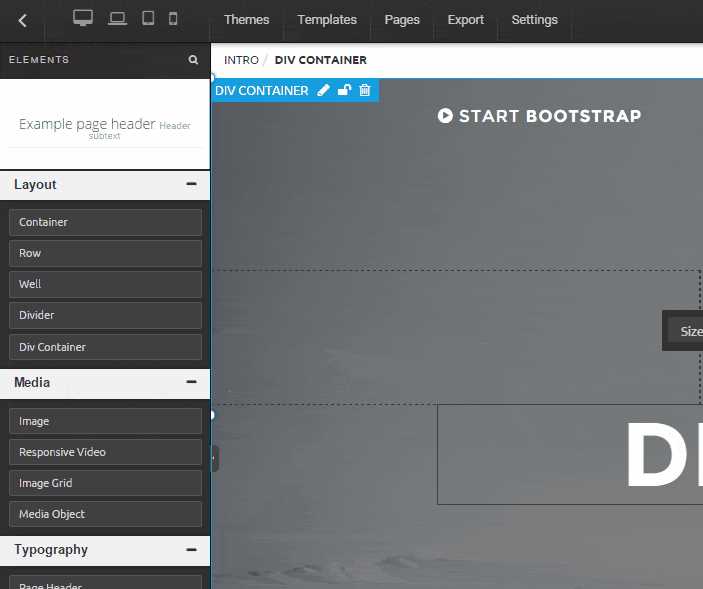
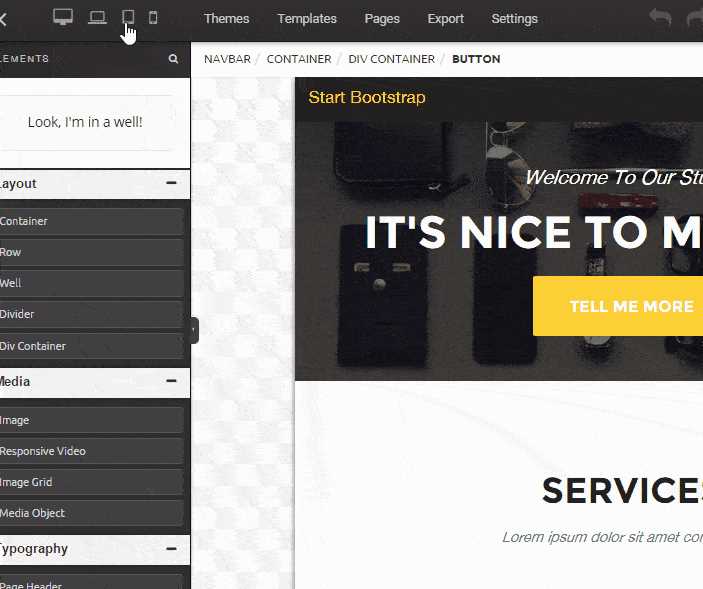
创建漂亮的响应站点。一次构建即可将您的内容提供给台式机,平板电脑和移动网络用户。那么,为什么要响应呢?好吧,这样做有很多优点,具体取决于您当前的开发周期。一次构建您的网站并定位到多个设备。您甚至可以声明什么内容显示在哪种类型的设备上。假设您只想在移动设备上显示特定内容,则可以通过在div包装器中添加一个类(即.visible-xs或.visible-sm),在代码中简单地声明它来实现。Google和其他搜索引擎喜欢设计为具有响应能力的网站,因为它们可以基于搜索器设备提供搜索结果。因此,SEO方面是另一个主要优势。...根据我们在真实用户领域的经验,我们还有一个持续的使命,就是为我们的RWB平台选择最可靠的框架,我们决定选择Twitter Bootstrap框架。最初由Twitter的设计师和开发人员于2010年中期创建。它于2011年8月19日正式向公众发布。我们从一开始就着手开发框架。v3的方法侧重于“移动优先”方法,该方法完全符合我们公司的核心愿景。
分类目录
Web版Build Responsive的替代品
2
2
2
2
1
1
1
0
PageShare Factory Online Services
无需HTML编码,无需拖放,无需在线修改,只需提交Google Docs,Microsoft Office Word,OpenOffice,LibreOffice,SoftMaker,Kingsoft WPS等导出的压缩HTML,即可免费在线构建和下载网站。
- 免费应用
- Web